About me
Hello! I’m a talented and creative Visual Communicator, someone who is working
for better achievements and better career. Repeatedly recognized for creative,
conceptual and analytical talents. I’m someone who’d like to demonstrate
success transforming client ideas into beautiful, functional design solutions.
Let's work together !
Address
- 59000 Lille - France
- +33 7 61 46 89 87
- celinesalamehvisual@gmail.com
Paper Messengers – ISTD 2014 – “Tara”
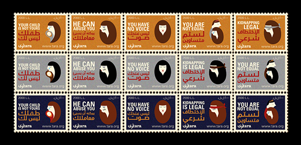
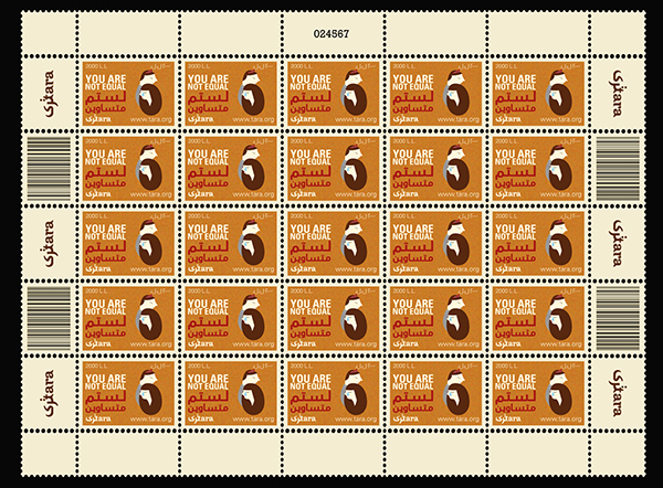
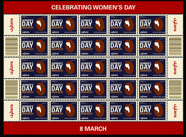
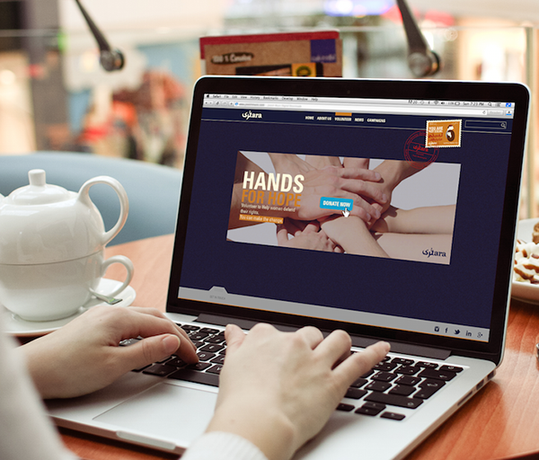
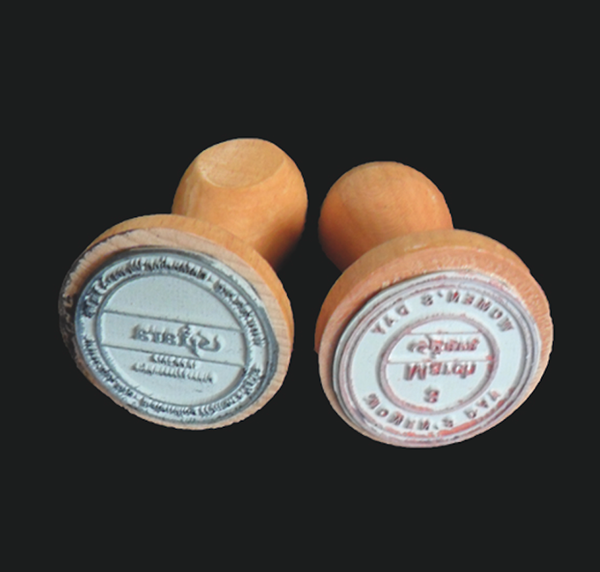
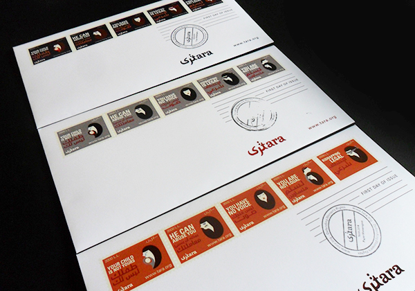
The International Society of Typographic Design release a set of five student briefs annually. The brief I chose to submit was named ‘Paper Messengers’ and was to design a set of stamps (minimum of five), a publication/experience, a first day cover and presentation pack. After a long research, I chose Women’s Rights as a subject.
The Link was to relate my job as a visual communicator and a female in this society by creating a campaign using provocative messages, defending women’s rights in this country to bring awareness about this important subject of study since not all women know their rights. The project was then judged by the society based on its typographic value. I was accredited by the society and thus received a permanent membership.
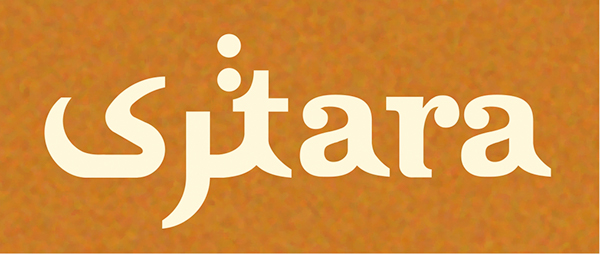
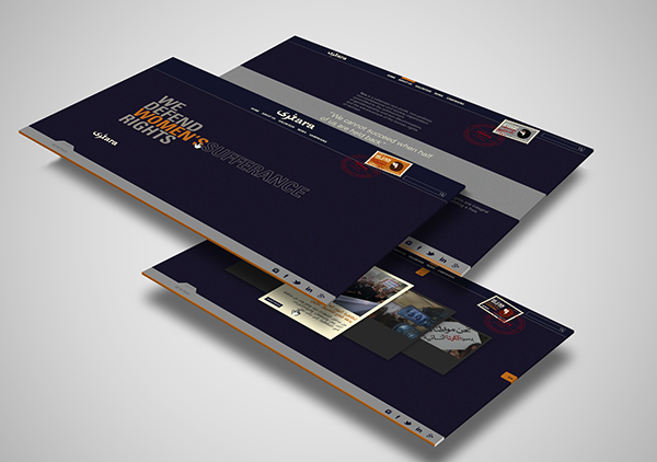
“Tara” was chosen as a name for this project since “Tara” is a female Goddess that has been known for many forms in every culture. She is the Goddess of peace and protection. She embodies the feminine strengths of great caring and compassion, the ability to endure stressful and even terrifying moments, the acts of creation, and the source of sustenance and protection. Not only ”Tara” means the Goddess in other cultures, but also it means ”To see” in Arabic. This matching title is a pun to shed up lights of the Women’s rights issues.
The title logo ”Tara” was made in a very specific way using Clarendon as a base for the logo creation since it has the strong feel and creating the Arabic version out of it. Connecting these two words together by the letter ”t” made a total success and reflected a strong feel for the project itself.
References:
MISTD
- ClientBrand & Co
- DateJune 2, 2014
- CategoryBranding, Typography, Video Production, Web Design
celinesalamehvisual@gmail.com
+33 7 61 46 89 87
+33 7 61 46 89 87
© Copyright 2021 Celine Salame. All Rights Reserved